Product Design
Creating a platform to improve gym efficiency for CMU students.
Role
Head of Product & Design
Duration
6 months
Tools
Figma
Google Suite
❓ Overall Problem Space
Gym facilities at CMU are often crowded, making working out and healthy habits hard to maintain.
Based on feedback from numerous CMU students and our own experiences, the CMU gym often feels overcrowded, turning what should be a positive workout into a frustrating experience. Many students have expressed the need for a solution to this.
A question from a CMU student to post on the CMU gym instagram.

A snapshot of what the gym looks like. Oftentimes, these are all filled!

✨ Solution Snapshot (Mobile Version)
With Open Gym, students can gather quick and detailed insight into busyness of gym facilities on campus.
Based on feedback from numerous CMU students and our own experiences, the CMU gym often feels overcrowded, turning what should be a positive workout into a frustrating experience. Many students have expressed the need for a solution to this.


🔬 Discover: Researching CMU students
Of course, our original view needed to be validated and explored through research, so we began the research process by interviewing 2 students formally, guerrilla interviewing 12 more students, and sending out a survey to students about their gym going process. What we wanted to discover were the overall pain points that students run into when it comes to their gym experience, particularly at the CMU gym.
Example Q 1.0
What pieces of information do you wish you could obtain before heading to the gym that would enhance your experience?
Example Q 2.0
What is the average time you spend waiting for a machine to become available during your workout?


User Quotes
“Sometimes you have to wait upwards of half an hour to get a bench or squat rack”
“I want to know what machines are available, I just wanna hit abs man 😭”

Interview Takeaways
From our interviews, we validated that a lot of the struggles for a CMU student in regards to the gym really does lie in the busyness of the machines and gyms. There were also some concerns about the fact that because the gym was often packed, some people were intimidated to go to the gym to check it out.
Around 78% of surveyed students complain that the gym is always moderately - very busy at the time they go, leading to long wait times and too much intimidation.
Over 90% of gym inflows are directed to the Cohon University Fitness Center.
Students have varied schedules, making it hard to plan their gym schedules, as a result leading to less trust in the CMU gym.
🙆 Understanding our users from our research
We gathered lots of responses that highlighted the struggles that people were going through, so we needed to find some ways to more easily digest and visualize the information that we had received. We did a quick sprint using a customer journey map, some user personas, and a fishbone diagram to lay out the pain points and gather a better understanding of the research and people we had questioned.
User Persona & Fishbone Diagram

Quick Customer Journey Map

🏃♀️ Starting ideation: the LARGEST consideration
So from here, how can we begin with creating a solution? The only thing that we knew at this point was in order for us to feasibly deploy anything, we needed the application to be simple. We were working with less experienced developers, so the largest consideration that we had was feasibility in this project.
How might we prioritize targeting certain pain points and features to ensure both usability and development feasability?
There were three main things we wanted to focus on based on the user research:
-
Reduce confusion by providing general information about gym schedules (opening and closing) and amenities
-
Show busyness of gyms
-
Show occupancy of specific machines
But because of this feasibility consideration we had to ask ourselves: what is in highest demand & easiest to accomplish?

Some notes on feasibility.
As we continued to question which had the easiest feasability, we had to ideate on the simplest way to execute the solution to some of these ideas. Keep in mind, our ideated methods of implementation are not perfect and we may have overlooked solutions, but this was our understanding of feasibility for each of these areas:
How might we prioritize targeting certain pain points and features to ensure both usability and development feasability?

So ultimately...
Priority 1(P0): How might we showcase the busyness of gyms in an easy and digestible way?
Priority 2 (P0): How might we reduce intimidation and confusion towards the CMU gym feasibly?
Priority 3 (P1): How might we provide occupancy of specific machines in gym facilities?
💭 Starting ideation through an analysis of similar platforms.
We began by looking into other websites or platforms that quickly allowed for checking occupancy of gym facilities and we were able to find that many were also for college gyms.


We reached out to a UC Berkeley Alumni, Nick Rose, who was involved in research and development of the occupancy project at UC Berkeley to discuss more about implementation.
A lot of what we saw was that some colleges had very simple and similar designs, using a meter to represent occupancy and incliding very short descriptions and information about the gym.
In contrast, we decided to include a gym details page to provide more in-depth information while also reducing unfamiliarity of CMU gyms.
🎨 Starting designing.
We began by looking into other websites or platforms that quickly allowed for checking occupancy of gym facilities and we were able to find that many were also for college gyms.


Throughout our sketches, our main visuals were to show occupancy in a very simple and easy way -- through a meter diagram and an occupancy forecast.
Our features were based around occupancy. But how could we get that data?
Technical Implementation: the largest blocker -- gathering data from CMU.
We continuously held meetings with CMU administrators to facilitate communication of what student data we could gather. From our conversations, we discovered there were two forms of data we could receive:
1. Manual head count data
2. Card swipe data
We decided to add a third to ensure as much reliability as possible...
3. Bluetooth scanner data (physical bluetooth scanner)
Some other considerations when it came to student data were talked extensively as well. For example,
-
Security & Privacy
-
Automation and updating of data
🤔 If you’re curious about how we discussed technical and operational implementation of occupancy data, feel free to reach out. Would love to have a conversation around it!
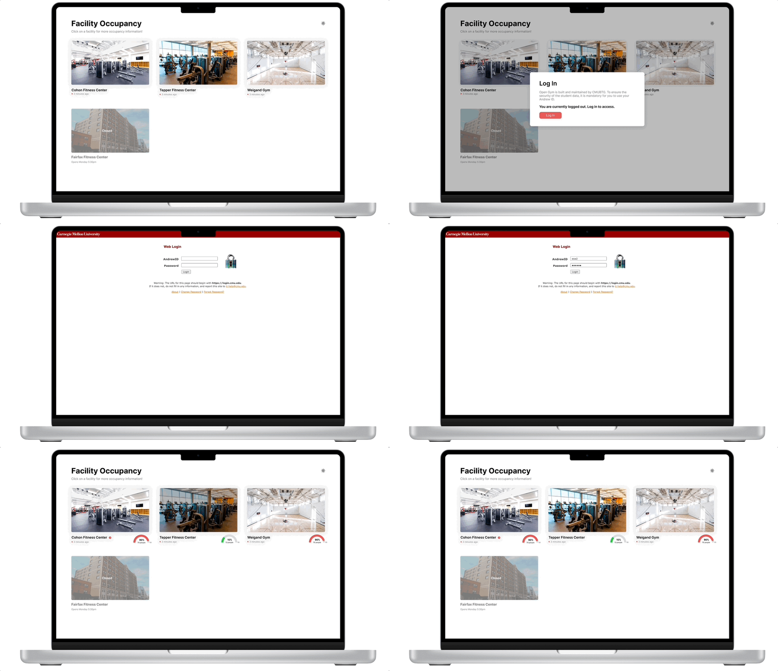
✨ Final Features (Laptop Version)
Login System Ensuring Security
To ensure security of student data, we established a login that goes through the two-step integration system before showing any sensitive data (ex: occupancy of gyms)

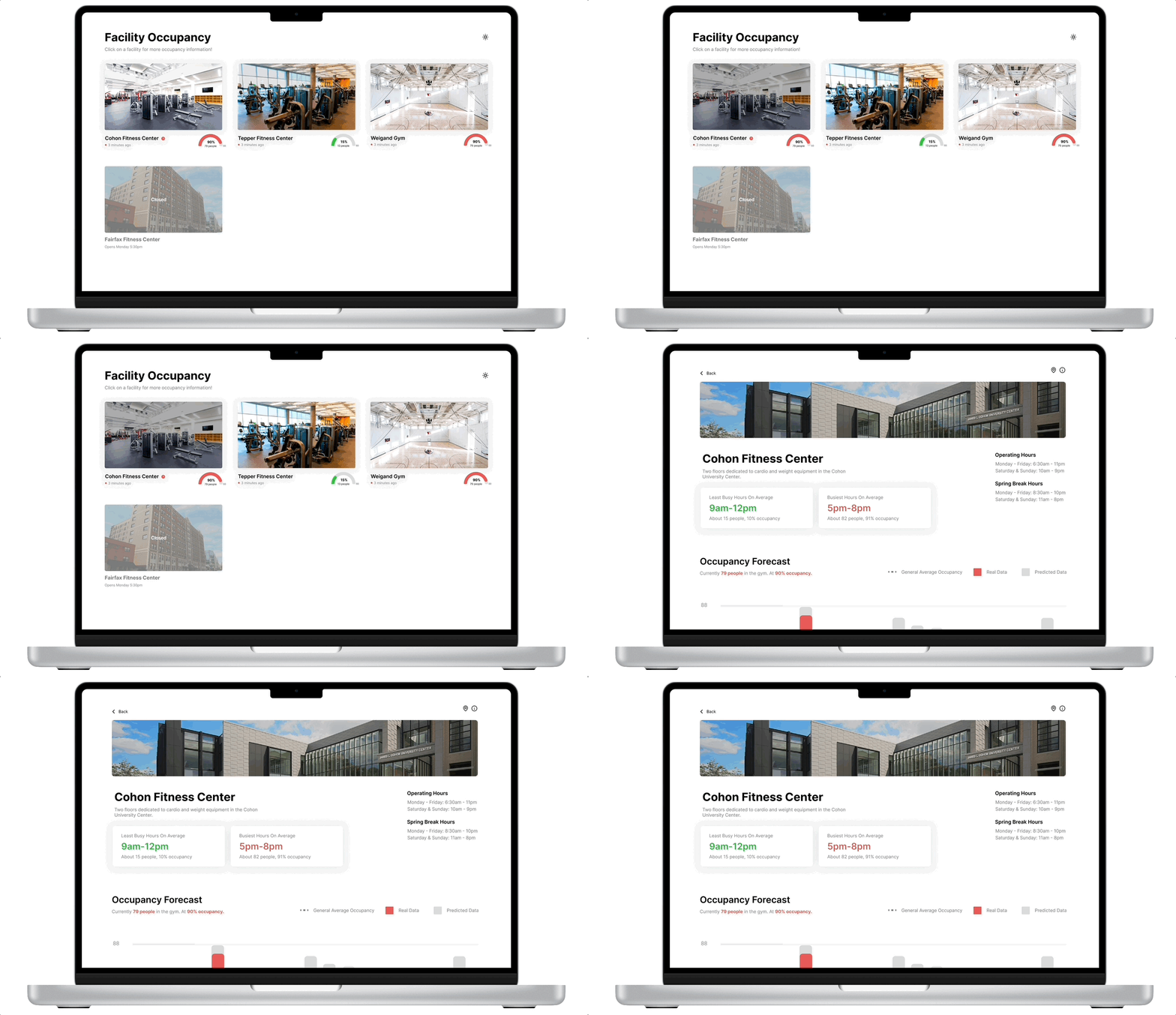
Quick Snapshot of Occupancy information
To ensure security of student data, we established a login that goes through the two-step integration system before showing any sensitive data (ex: occupancy of gyms)


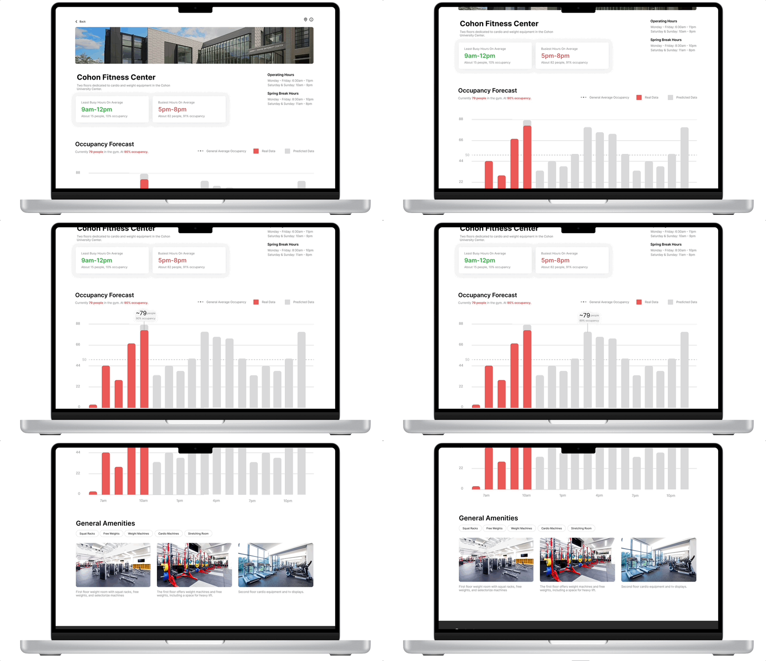
Detailed View of Each Gym
Quick snapshots of busy versus not as busy times, occupancy graph, and general amenities allows for more detailed view of gym to reduce "gymtimidation" and easier gym planning.
💥 Impact
We presented our project to our main CMU administrator point of contact, Alicia, and she is very excited and encouraging of where we have come. We’re now currently working with her to create the administrator dashboard using the data that we are collecting.
We also presented our project at Google in front of 4 product managers and 1 product designer. Gratefully, after the presentation, we got much praise, including this one!
"With this presentation, you all would pass the product manager interview at Google.”
Mike Capsambelis, Director of Product Management & Community Outreach Lead at Google
BTG at the Google presentation!


The lovely team ❤️


Presenting in progress...
➡️ Moving forward?
Moving forward we want to continue refining the platform before launching. In terms of product design:
-
A round of Beta testing & iteration
-
More solid brand design
-
Inclusion & design of specific machine occupancy information (currently working with another group who has found a way to track this data)
-
Inclusion & design of gym classes consolidation and incorporation
We have lots more to do! Excited to see what it will become. 🎉
🤔 Final Thoughts
-
I wish we had focused more on insights from research. I think we had an idea of what we wanted to focus on since the beginning and was swayed most towards that, but I think research brought a lot more insights we could have focused on.
-
Physical implementation is much harder than you think! Most of the year ended up being the business team having to communicate with CMU administrators to gather data and waiting for engineering development often misaligned with our timeline. I have many things that I wish I could have lead differently last year, but I’m grateful for the opportunity given to me and the things I learned leading so many people and such a large project.


